The updated Z Box experience starts before an app is opened. It starts on the home screen, where the launcher needs to feel clear, fast, and comfortable from the couch.
The refreshed Z Box Launcher UI is designed around that everyday living-room moment: turning on the TV, finding the right app, checking basic system status, and getting into entertainment or utility tools without unnecessary visual noise.
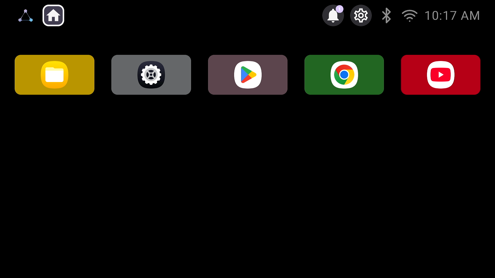
A Cleaner Home Screen
The new launcher uses a dark, minimal background to reduce visual clutter. Instead of filling the screen with too many panels, recommendations, or small text, it puts the focus on the apps and controls people are most likely to use.
This cleaner approach matters in a living-room setup. A TV interface should feel calm when it is idle and direct when it is being used. The updated launcher gives the Z Box a more focused first screen that is easier to scan from a distance.
Fast Access to Everyday Apps
The main row is built around common workflows. Files gives users quick access to local content. Google Play makes it easier to find and manage apps. Chrome supports browsing, while YouTube covers one of the most common media use cases.
Together, these shortcuts make the launcher feel practical rather than decorative. The goal is not to show everything at once, but to make the most useful destinations visible first.
Built for the Living Room
The updated Launcher UI follows the same direction as the other Z Box updates: cleaner controls, easier access, and a more comfortable everyday experience.
Alongside the redesigned remote, refreshed exterior, and cooling improvements, the new launcher helps the Z Box feel more ready for modern living-room use. It is a simpler first screen for a device that is meant to be used often, from the sofa, with as little friction as possible.